#001 Colour Palettes
Hello there! Welcome to my first newsletter. Thanks for subscribing. In each post I'm going to pick a theme and talk about my practice. I'll also share some things I’ve enjoyed.
I thought a good topic for my first newsletter would be colour as I often get asked about this. I really love colour and zoom in on it everywhere in the environment. I can get quite distracted by combinations I see every day and feel I need to record them. I often return to favourite palettes but I don’t think I have a defining palette in my illustration and sketchbook work. It’s sometimes difficult to notice things in your own work so maybe others will say that they can recognise colour themes in my work. I feel energised when I experiment with new palettes. Here are some of the ways in which I find palettes, create my own and how I use them in my work.
When I'm out and about

I take a lot of photos and save them in a colour folder on my phone. I have found potential palettes in book shops, supermarkets and even restaurant toilet decor!
In galleries and museums

I often take photos of colour palettes I’ve seen in galleries and museums. Looking back at photos for this post, I’ve realised that I’m repeatedly drawn to certain colour combinations.
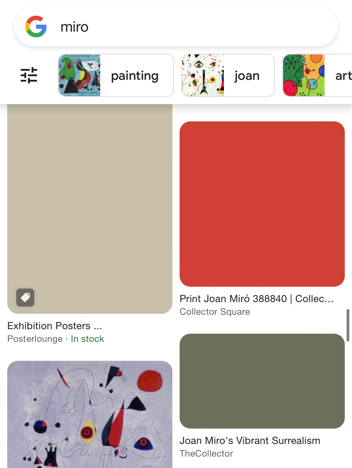
Google image search
If my phone has an unstable internet connection when I’m searching on Google images, it will take time for the page to load and in place of the images a block of colour appears. I often screenshot these combinations as they can be surprisingly fantastic.
Using palettes from my photos and making my own
When I’m going out sketching I plan which materials and palettes to take with me. I look back in the colour folder and I try to find those particular colours in my materials. Sometimes I pick a colour and create a palette with different shades. I collect a mix of wet materials (brush pens, markers) and dry materials (pastels and coloured pencils) to ensure my sketching has texture and contrast. I scribble palettes at the front of my sketchbook or in a notebook and usually take three or four sets of materials with me. This really helps me to focus on drawing when I get there as I only have to make decisions about subject and composition. When I find something to draw, I choose from the palettes I have and find one that goes with the atmosphere/setting/subject that I’ve found. On days when I’m in a rush I’ll take a random pencil case and use something simple from it like one brush pen and a grey pencil.
Limited palette
I really love using a limited palette. I love the simplicity and impact it can have and the way it can focus attention on particular things. It’s also useful when thinking about tone. I often pick one colour and choose a dark, mid and light tone material and then use that for sketching. If I’m using two materials the lightest tone is usually the negative space of the page. When I’m sketching I think about the darkest and lightest thing in the picture and I will apply that to the tone from that palette. That way, trees in a landscape will end up red or whatever colour depending on the tone that fits the light in the scene and the distance it is from me or what balances the picture. It doesn’t always work but I just experiment (and turn the page and start again if it’s dreadful!).
Favourite material
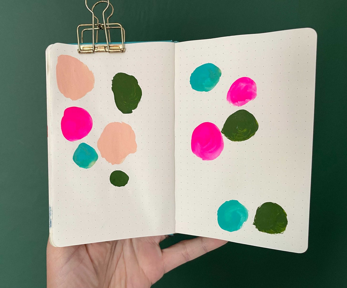
Sometimes I find a material that I really love and use it a lot in a sketchbook. I like to investigate which other materials will work with it. In the summer I really enjoyed using Pilot Pintor pens. They are chunky and leave a matt, gouache like mark. Sometimes I planned a palette around one of them. In the pictures above I spent several weeks returning to the peach colour as a starting point.
Inspiration from the location
The place I am going to draw can also be great for inspiration. I loved the summery colours in this shop front and the one next door in Aldeburgh. It inspired the beach drawing I did next time I visited.
New learning
I’ve just started an MA in Children’s Book Illustration at Cambridge School of Art and I will be learning lots about colour and how to use it. So far my use has been instinctive so I’m really excited about learning more about the interaction of colour. I will post again about colour at a later date when I start experimenting more.
Subscribers’ sketchbook peek

I really loved Sarah Lacey’s idea of putting an illustration into her newsletter that is just for subscribers. I will do this in each post showing something from my sketchbook that will only feature here.
What I have been reading
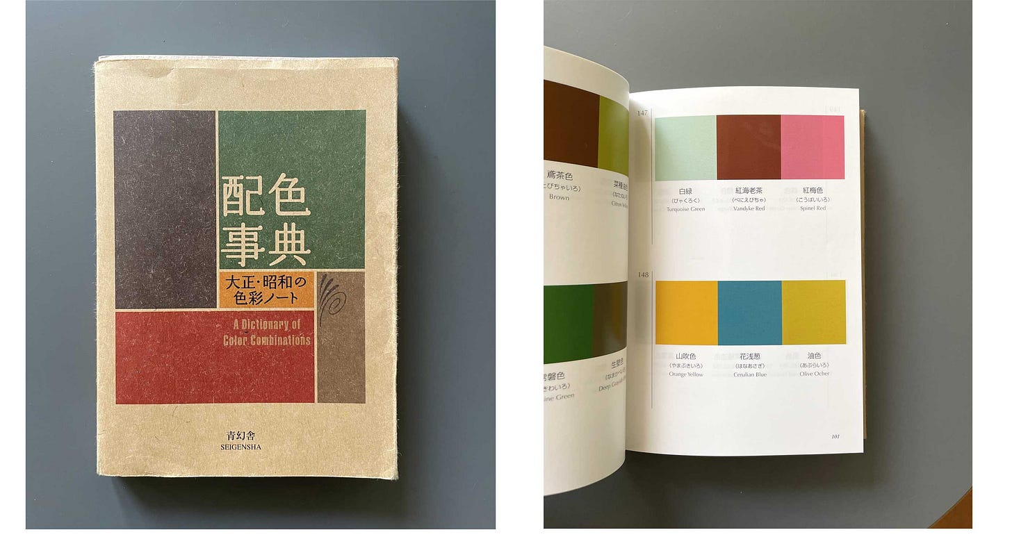
This is a great reference book for inspiration. I haven’t managed to find a copy with an English foreword but the colour names are listed in both English and Japanese.
What I have been listening to
First Draft with Sarah Enni podcast. This is a great series interviewing writers. I really enjoyed this Jon Klassen episode.
https://www.firstdraftpod.com/audio-episodes/2019/3/19/jon-klassen
A picture book I love
This is such a beautiful silent book. The composition and storytelling are so exciting and it has a great ending. So much inspiration here for urban sketching too.
That’s all from me. I would love to know how you use colour, if you use any of these ways or have found anything useful. Please let me know in the comments below.
Speak soon,
Charlotte


Ahh, so lovely to read about your colour inspo! You are great at colour. And yay for starting the MA. I am jealous :)
Thanks for sharing it! I try to do the same for my color palettes! 😍