


Sketchbook Tour: Bathing in Colour
Using the same palette for a series of drawings

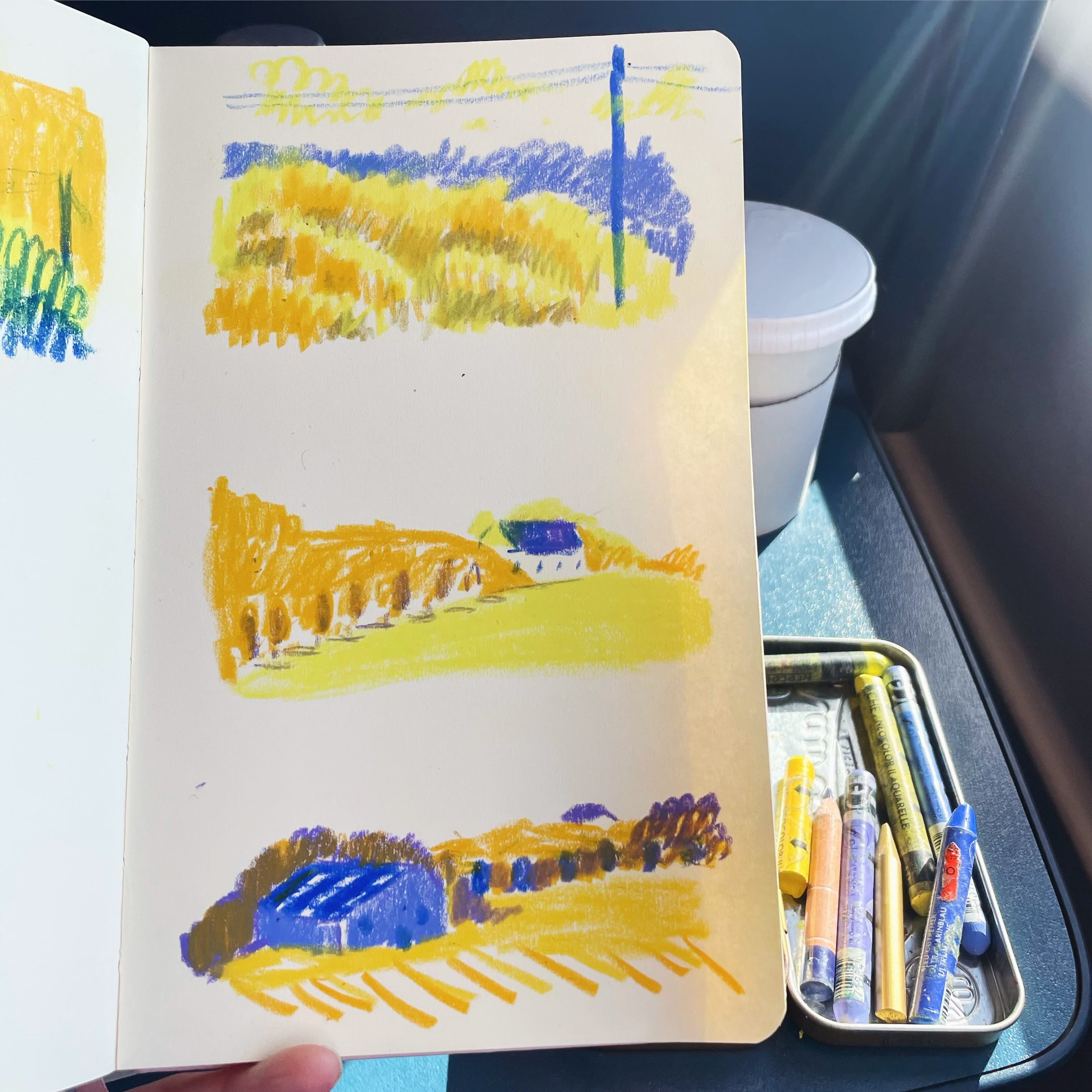
Hi all
Hope all well. It’s nearly the end of March so here’s a closer look at colour in my sketchbooks. This month I’m zooming in on when I have chosen a palette for a holiday or series of drawings. Since making the video below I’ve realised that I’d been thinking about these blues and yellows for a while!


At the end of the post there’s an extra video tour of a sketchbook I made for my MA Graduation Exhibition exploring contrast and colour between page turns.
Here’s the video
Key points
The great thing about a limited palette is that it helps me get on with drawing. It’s interesting to use it over a series of drawings to see how the different quantities affect mood.
I need time to warm up and am more confident as the drawings go on.
A look at some new palette ideas I’ve found in a book of Hokusai prints.